
Brand
A tick, some sparkle,
and a lot of calm.
Tickd is a calm daily planner for iPhone and Apple Watch. The brand carries one idea everywhere: people don't run out of time — they run out of space. Every asset, colour and sentence below exists to give days some space back.
Calm
Cream washes, soft pastels, gentle motion. Nothing shouts, nothing nags.
Momentum
Progress is the hero — ticks, filling lines, quiet streaks. Celebrated, never demanded.
Space
Generous whitespace, one idea at a time, room to breathe in every layout.
Logo
The mark is a hand-drawn coral tick with two sparkles — momentum, celebrated quietly. Use the full-colour mark on light, calm backgrounds; switch to the white variants on ink.
Quick rules
- Clear space — keep at least the width of the tick's stroke free on all sides.
- Don't recolour — the tick is coral (or ink / white); it never turns blue.
- Don't stretch, rotate or add effects — it already has all the dimension it needs.
- Busy backgrounds — use the mono or line variants, or step up to a lockup on a card.
- The serif wordmark is lettering, not a font — always use the supplied files.
Color
The palette lives in the app first — soft pastels on a warm cream wash, anchored by ink. Tap any swatch to copy its hex.
Core
Canvas wash
Every screen sits on this vertical gradient — never flat white.
Task colours
A 12-tone wheel, warm to cool. In the app they render as 15% pastel fills with tinted strokes — never solid blocks behind text.
Gradients
#FF8FA3 → #9095FF#FFC36B → #FF8FA3 → #9095FF#FF8FA3 → #9095FF → #7FE0BE#3B3A66 → #34335ATypography
No custom fonts. Tickd speaks in the platform's own voice — SF Pro on Apple platforms, the system stack on the web — so it always feels native.
Design your day.
ui-rounded / SF Pro Rounded · 700–800 · tight leading
Headlines, big numbers, celebrations — anywhere the brand smiles.
A calm timeline, gentle momentum, and an AI that turns "plan my afternoon" into a real schedule.
-apple-system / SF Pro Text · 400–600
Copy, cards, chips. Comfortable sizes, generous line height.
A quiet truth
13px · 650 · letter-spacing .14em · brand pink
Small section markers, always uppercase, always pink.
UI & motion
Tickd's interface is pills, cards and lines — soft geometry with real physics. Everything springs, breathes or fills; nothing snaps or flashes.
Shape language
radius 28 · pink gradient · soft glowradius 16 · pastel fill · 5px colour edgechips · radius 12 · 14% tintstation dots · breathing glow- Corner radii — 16 for cards and inputs, 26 for hero cards and sheets, full pill for buttons.
- Shadows — always indigo-tinted and soft:
0 10px 30px rgba(100,103,170,.10). Never grey, never harsh. - Surfaces — white cards on the cream wash; ink cards reserved for Pro and emphasis.
Motion principles
- Spring, don't slide — the house curve is
cubic-bezier(.34, 1.4, .44, 1), a gentle overshoot that makes things feel placed, not animated. - Fill, don't flash — progress is shown by lines and curves filling with colour (the path, the momentum hump, the journey).
- Breathe — resting focal points (the "now" dot, the "you" marker) pulse slowly at 2–2.5s. Alive, not busy.
- Demos drive themselves — marketing demos autoplay at a calm ~1s cadence; the moment a visitor touches one, the autopilot yields for good.
- Respect reduced motion — with
prefers-reduced-motion, everything renders complete and still. Always. - Confetti is earned — it falls only for a fully completed day. Rare, brief, never looping.
The cast
A small troupe of recurring characters carries the brand. They always mean the same thing — never use them decoratively.

The Tick
The protagonist. A moment of progress, drawn by hand. Appears when something is truly done.
Sparkles
Quiet celebration and possibility. Two at most, riding alongside the tick or an empty day.
The Sun
Rise and Shine — the day's opening anchor. Warm amber, always first.
The Moon
Wind Down — the day's closing anchor. Periwinkle, always last.
The Flame
Streaks. Lights up from day two; never guilt-trips when it goes out.
The Star
A perfect day. Amber, earned, one per day at most — it crowns the week chart.
The You-dot
Presence. A breathing white-and-pink dot marking "now" on the path and "you" on the journey.
Confetti
The finale. Falls once, when every station is done. Task-colour palette only.
Persona & emotion art
Tickd's story art follows one persona: the buried planner — capable, caring, and drowning in their own list. Warm hand-drawn illustration, real rooms, real feelings. The arc is always the same: swirl → overwhelm → a quiet truth → space.
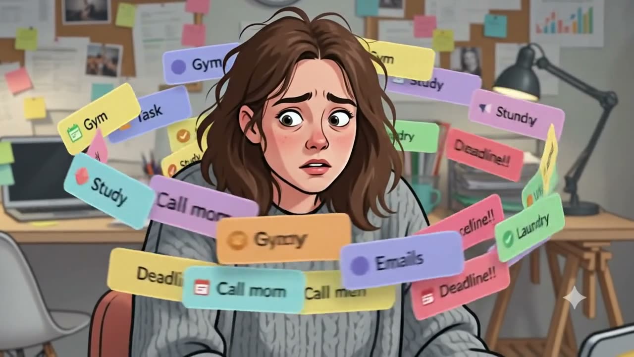
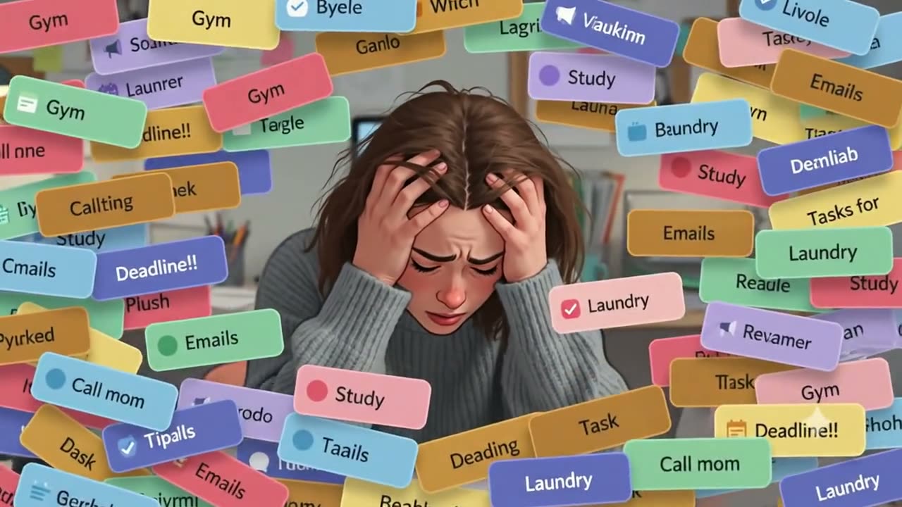
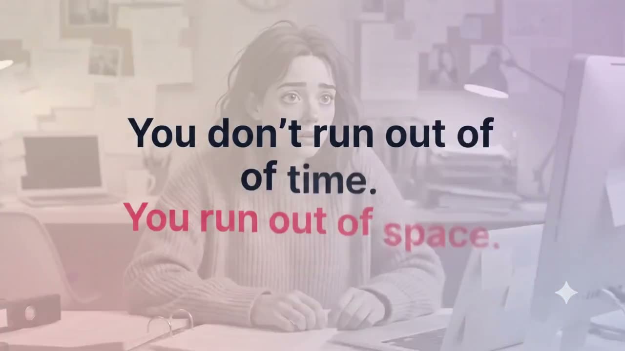
- Style — warm digital hand-drawn illustration; soft light, lived-in spaces, expressive faces. Never flat corporate vector people.
- Task pills as weather — chaos is drawn with the app's own pastel task pills swirling around the persona.
- Resolution is mandatory — emotion art may show stress, but every sequence must land on calm. We never leave the persona buried.
- Colour discipline — chaos scenes desaturate toward grey; calm returns with the cream wash and coral.
Voice & tone
Calm, encouraging, a little playful — never nagging, never guilt. Progress is celebrated; an off day is met with a shrug and a fresh start.
Most people don't run out of time.
They run out of space.
Design your day.
Don't just list it.
Progress,
not pressure.
For later,
not never.
Say
- "Look at you, quietly unstoppable."
- "Small ticks, big ripples."
- "Didn't get to it? Move it to tomorrow."
- "Your day is open."
Never say
- "You missed 4 tasks yesterday." — guilt
- "Crush your goals!" — hustle-speak
- "Streak lost 😢" — punishment
- "Productivity unlocked!!" — noise
Marketing
Marketing tells the film's story in miniature: name the overwhelm, offer space, show the app doing the work. Demos should move on their own — visitors watch, then take over.
Headline bank
- Lead — "Most people don't run out of time. They run out of space."
- Product — "Just say it. Tickd plans it." · "Your day is a line, not a pile."
- Momentum — "Progress, not pressure."
- Closer — "Give your days some space." · "Plan calmly. Move steadily."
Rules of engagement
- Every piece ends with the App Store badge and the fineprint "Free to download · No account needed."
- Show the product moving — the path filling, pills snapping into a schedule — not static screenshots alone.
- App Store carousel frames (in
assets/screenshots/) are the canonical product shots. - Pricing is always stated plainly: free forever core, Pro for unlimited AI planning.
Offline & print
- One-colour print — use the black lockups/wordmark on light stock, white on dark stock. Never print the gradient mark in one colour.
- Minimum sizes — mark ≥ 10 mm tall; horizontal lockup ≥ 30 mm wide; below that, use the mark alone.
- Clear space — the tick's stroke width on all sides, doubled for posters.
- Paper — warm white / cream stock over bright white; the brand lives on cream.
- Full colour available? — prefer the full-colour mark (
tickd-mark-1024) with the coral kept true:#E8907E.
- Sender — "Tickd" (never "Tickd Team" or "no-reply"). Support replies come from a person.
- Header — horizontal ink lockup on the cream wash; footer carries the mark alone.
- Typography — system font stack; one headline, short body, one action. Email is not a newsletter — it's a note.
- Tone — like the app: "Your week, gently" not "YOUR WEEKLY PRODUCTIVITY REPORT".
- Sign-off — "Plan calmly, move steadily. — Tickd"
- Frequency — only what helps: receipts, real feature news, replies. No drip campaigns.
Accessibility
- Contrast — body text is always ink (
#34335A) or slate on light surfaces (AA or better). Pastels are fills, not text colours; in the app, task tints pass through a WCAG-adjustingaccessibleTint()before becoming text. - Small text rule — never set text under 14 px in pink, amber or mint on the cream wash.
- Motion — every animation has a
prefers-reduced-motionfallback that renders the completed state, static. - Keyboard & touch — interactive demos accept keyboard input (the sliders take arrow keys); touch targets stay ≥ 44 px.
- Alt text — the mark's alt is simply "Tickd"; decorative sparkles and doodles are
aria-hidden. - Never rely on colour alone — done states also strike through; anchors also carry the "Anchor" chip.
Assets
Everything on this page, in one folder.
tickd-brand-assets.zip
All 32 logo files — marks, lockups, wordmarks, app icons, social frames and favicons. PNG, transparent where it matters.
- Product shots — the App Store carousel frames live in
assets/screenshots/on this site. - Film — the hero film (
assets/hero.mp4) and its stills (above) are the canonical emotion art. - Colours & type — copy hexes straight from the swatches; there is no font to license.
Governance
- Ownership — the Tickd brand and all assets on this page are © Ranju Jha. This kit is for press, partners and community use in reference to Tickd.
- Spelling — "Tickd" takes a capital T in prose; the lowercase serif "tickd" exists only inside the supplied wordmark files.
- No new variants — don't create additional logo colourways, badges or mascots. If something's missing, ask.
- No implied endorsement — the mark may identify Tickd, never suggest partnership or sponsorship without written agreement.
- Questions & permissions — heywrist.com/tickd/support
- Version — Brand system v1.0 · July 2026.
Social media
Low frequency, high warmth. Celebrate quietly, ship visibly, never post filler.